The Ultimate Guide to Google Fonts for Web Developers
A comprehensive breakdown of how to properly select, pair, and optimize open-source fonts for blazing fast websites.
Google Fonts has fundamentally democratized web typography, giving developers and designers instant, free access to over 1,500 open-source font families. However, with this massive library comes the paradox of choice. Selecting the right typography isn't just about aesthetics; it heavily impacts web performance, readability, and overall user experience. This guide will walk you through the absolute best practices for integrating public font links into your Next.js or React applications.
When browsing the Google Fonts repository, you should prioritize variable fonts whenever possible. Variable fonts, such as Inter or Roboto Flex, package multiple weights and styles into a single, highly compressed file. This drastically reduces HTTP requests and payload size, ensuring your site loads instantly while still allowing you to build the complex visual hierarchy that modern interfaces demand.
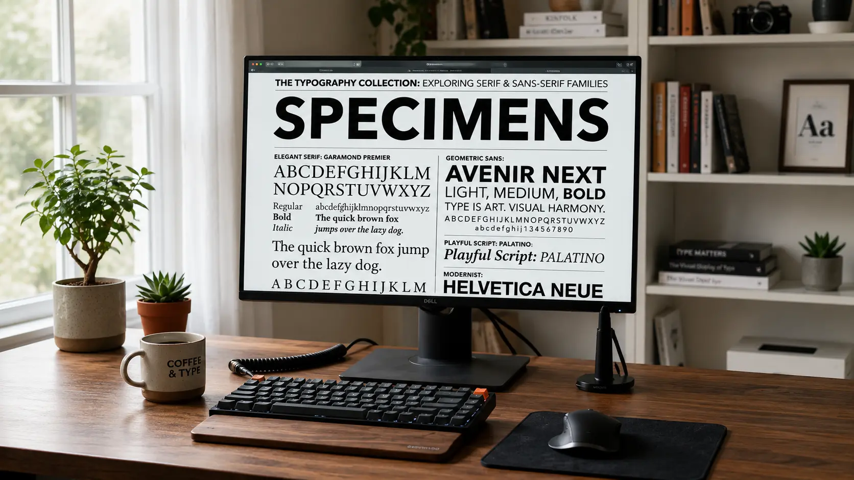
For body text, legibility is king. You cannot go wrong with clean, neo-grotesque sans-serifs like Open Sans or Lato. However, if you want your headings to pack a punch, consider pairing those neutral body fonts with a highly stylized, high-contrast display serif like Playfair Display. This creates a beautiful tension between the modern and the classical, a technique frequently discussed in our deep dive into serif font trends.
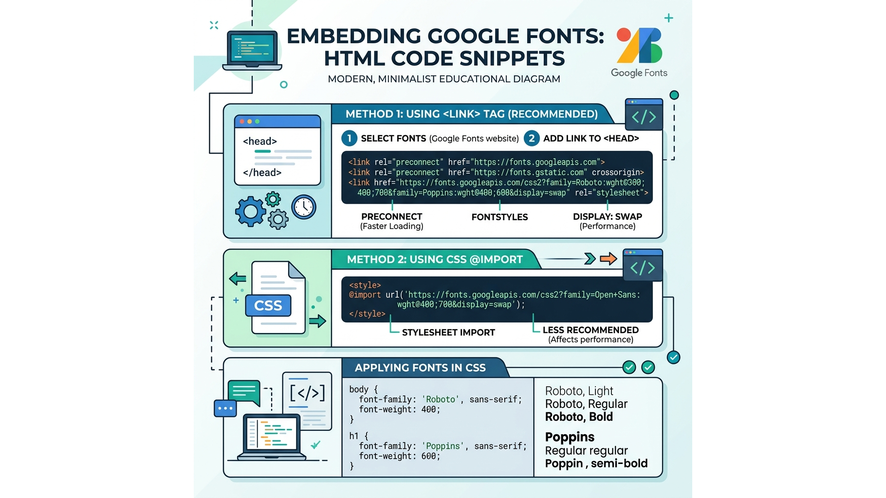
Tutorial: How to properly embed Google Fonts using standard HTML tags.
Always remember to utilize `font-display: swap` in your CSS declarations to ensure that your text remains completely visible during the brief millisecond it takes for the custom web font to download.
📦 Download the Designer Asset Pack
Enjoyed the resources in this article? Enter your email to unlock my private vault of free premium UI templates, custom vector assets, and typography configurations delivered straight to your inbox.
Related Articles
Best 5 free fonts - Designer Collection
Looking to design your own book cover? This is an excellent choice of free fonts crafted by top designers.

Why Serif Fonts Are Making a Huge Comeback
After years of minimalist sans-serif domination, elegant serif typefaces are reclaiming the digital landscape.
Understanding Font Weights and Visual Hierarchy
Master the art of guiding the user's eye using typography size, weight, and spatial alignment.